
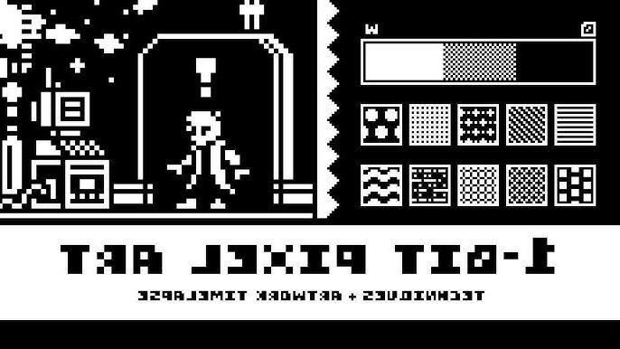
What Exactly Is a 1-Bit Game?
A 1-bit game refers to any visual style that uses just two colors—traditionally black and white—to represent everything on screen. The term “1-bit” comes from computing, where one bit of data can only be 0 or 1, meaning on or off, light or dark.
While early consoles and PCs sometimes used this style out of necessity, modern developers adopt it by choice. It’s not about limitation anymore—it’s about focus, mood, and raw contrast.
Think of it like this: if 3D realism is cinema, 1-bit art is noir photography.
Why Go 1-Bit in 2025?
You might wonder—why would anyone limit themselves to two colors when today’s tools can render photorealistic skin pores and dynamic reflections? The answer lies in clarity and emotion.
A 1-bit game forces players to see differently. It strips away visual clutter and pulls focus toward gameplay mechanics, storytelling, and sound design. The contrast also makes it instantly recognizable.
Games like Return of the Obra Dinn by Lucas Pope and World of Horror by Panstasz proved that minimalism can be deeply atmospheric—and even unsettling.
The Core Challenge: Readability
Creating a 1-bit aesthetic is not just about hitting “grayscale mode.” The real art lies in clarity. When you’ve only got black and white, shapes need to communicate everything—form, light, motion, emotion.
| Visual Style | Color Range | Focus | Technical Complexity | Example Game |
|---|---|---|---|---|
| 1-bit | 2 colors (black & white) | Silhouette, contrast, readability | Low render complexity, high artistic precision | Return of the Obra Dinn |
| 8-bit | Up to 256 colors | Nostalgia, simplicity | Moderate | Celeste Classic |
| 16-bit | Thousands of colors | Detail, shading | Medium-high | Hyper Light Drifter |
| Modern pixel art | Unlimited | Atmosphere, dynamic lighting | High | Eastward |
As you can see, fewer colors often mean more thinking per pixel. You don’t get to hide mistakes under gradients or particle effects. That’s why mastering 1-bit art trains your design instincts like nothing else.
Step 1: Define the Mood
Before you touch a pixel, decide the emotional tone of your game.
- Mystery or tension? Go for sharp lighting, heavy shadows, and dense pixel noise.
- Calm exploration? Soften your contrasts and add more white space.
- Retro arcade? Use clear outlines and repetitive patterns for rhythm.
This step may sound philosophical, but it drives every decision you’ll make later—from tile patterns to animation pacing.
Step 2: Choose the Right Tools
Contrary to what some think, you don’t need ancient software to make a 1-bit game. Here are some of the best modern tools for both artists and developers:
| Purpose | Recommended Tools | Notes |
|---|---|---|
| Pixel art creation | Aseprite, Piskel, GrafX2 | Layer control, animation, palette locking |
| Game engines | Godot, Unity (2D mode), Pico-8 | Perfect for small or experimental projects |
| Palette testing | Lospec, Coolors | Helps visualize black/white contrast |
| Audio design | Bfxr, Audacity | Retro-style chiptune sound effects |
| Version control | GitHub, Itch.io devlogs | Essential for tracking and sharing builds |
Aseprite remains the go-to tool for many pixel artists because it balances simplicity with precision. Pair it with Godot for smooth 2D workflows, and you’ve got a professional-grade setup without spending a fortune.
Step 3: Think in Negative Space
Designing a 1-bit scene means sculpting light and shadow at once. You’re constantly asking: what happens if I remove this line? Can this object still read without outlines?
- Use dithering (checkerboard patterns) to simulate mid-tones.
- Create visual hierarchy by balancing black and white zones.
- Don’t rely on outlines for every object—play with implied edges.
- Animate subtly; over-movement can ruin the illusion of weight.
The best 1-bit games often look alive precisely because they understand stillness.
Step 4: Build Around the Player’s Imagination
Since the player only sees silhouettes, their mind fills in the blanks. That’s where magic happens. Every flicker of white can be fire, reflection, or a ghost’s whisper.
Your job as a developer is to give just enough information for the brain to interpret the rest. Good 1-bit design doesn’t shout; it suggests.
Balancing Art and Code
From a coding standpoint, 1-bit games are refreshingly lightweight. You can achieve strong visuals without heavy textures or post-processing. But optimization still matters.
- Compress sprite sheets efficiently.
- Use simple collision layers (no need for complex physics).
- Keep UI clean and high-contrast.
- Add CRT shaders or subtle filters sparingly for atmosphere.
Common Mistakes Beginners Make
Everyone ruins their first few mockups. But learning from mistakes speeds up mastery.
- Over-dithering: makes the image noisy and unreadable.
- Too much detail: small forms blur together.
- Inconsistent lighting logic: shadows don’t align, killing depth.
- Ignoring animation rhythm: abrupt movement looks glitchy, not stylish.
The Sound of Silence
Many 1-bit games pair their visuals with minimalist soundscapes—distant hums, static, or low-bit drum patterns. That restraint reinforces immersion. When you strip visuals down to two colors, every sound becomes a color itself.
1-Bit Aesthetics in Modern Culture
Beyond indie games, 1-bit aesthetics appear in branding, NFTs, and album art. Why? Because simplicity cuts through noise. It’s the design equivalent of whispering in a loud room.
When to Break the Rules
Once you understand 1-bit fundamentals, you can cheat. Some artists introduce a third accent color—a deep red or neon green—to guide attention. Others blend procedural shaders with static sprites to add subtle motion. The trick is to justify every deviation.
Tips from the Field
- Zoom out often; details mislead.
- Contrast first, style second.
- Always test in gameplay context, not isolation.
- Treat mistakes as texture—sometimes the “wrong” pixel adds soul.
Why Players Still Love It
Players don’t just admire 1-bit games—they feel them. The stark contrast connects subconsciously to primal storytelling: light versus dark, known versus unknown.
It’s that same instinct that makes us love shadow puppets or black-and-white cinema. 1-bit games remind us that imagination is the most powerful rendering engine ever made.
Final Thoughts: Less Color, More Clarity
In the end, 1-bit isn’t a downgrade—it’s a statement. It’s about confidence in simplicity. A well-crafted black-and-white frame can say more than a thousand textured polygons.
So whether you’re prototyping your first indie title or searching for a unique visual identity, try limiting your palette to two colors. You might discover that constraints don’t cage creativity—they sharpen it.
Author’s Note (E-E-A-T Transparency): This article was written by a digital artist and game designer with experience in pixel-based engines like Godot and Unity 2D. The examples and workflows discussed here reflect tested techniques from real production pipelines and feedback from active indie communities.